Landscaping is an artistic endeavor. It’s important to apply design elements the way an artist does when choosing a color palette for their next painting. Every color and shade awakens a specific feeling, and applying these properly will tie your landscape together and create a visionary masterpiece.
You can choose your color palette based on your favorite colors, and by understanding the principles of the color wheel. Some colors are warm, others cool. Each color has a certain identity and performs differently in the landscape.
Red. Excitement, intensity, passion, vitality, drama and energy. If you are trying to make an area feel tighter, rather than spread out then red is a good choice. Because it is a warm color, it needs to be in a bright space. Reds do not stand out in shady areas. It’s a great color for a focal point, such as a doorway or the dining area of your patio or deck. The complimentary color for red is green. Good examples of red blooms include geraniums, petunias, celosia and dahlias.
Yellow. Part of the warm color family, yellow is sunny, delightful and optimistic. If yellow is indeed a color you want in your landscape, do so with consideration. Too much yellow can overstimulate and bring on some anxious feelings. If you’re trying to capture the happiness of a bright sunshiny day with vibrant yellows, be certain to mix it up with some softer shades of yellow or break it up with another, complimentary color. If you’ve got a dreary space in your yard, throw in that bright yellow to cheer things up. Rudbeckia, coreopsis, goldenrod and sunflowers are a good options for bringing yellow into your landscape.
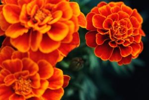
 Orange. A warm color, orange is a vivid and inviting. It transmits happiness and since it is known to stimulate hunger, it’s a a great color to include your outdoor entertaining spots. It should be used in much the same way as red, and if you choose to use it in your landscape make sure you add many different shades of orange and work them into large plantings. Examples of orange bloomers include marigolds, zinnias and tiger lilies.
Green. Yes, it’s a color that isn’t given enough consideration when planning your landscape. Green is restful and relaxing. It’s the color that turns your landscape into a refuge. As a cool color, green calms a space and can make a small space seem larger. One of the amazing things about cool colors is their ability to shine in the shady spots. There are so many hues of green in the plant world and combining them throughout the landscape adds tremendous interest. Ferns, moss, boxwood, liriope and hostas come in multiple foliage shades and shapes.
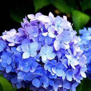
 Blue. Cool, calming and tranquil, it’s another cool color that can bring a sense of peace to your landscape. Because it has a tendency to fade into the backdrop, it’s important to bring some purple or yellow to the mix so the blue doesn’t get totally washed out. Blue flowers serve as a great accent to any other blue elements in your outdoor spaces. If you have blue pottery, blue pillows on your outdoor furniture or a water feature, then be sure to add some blue flowers. Blue flowers are rare, but varieties include asters, bellflowers, hyacinth, hydrangeas and delphinium.
Purple. It’s both a warm and cool color depending on how you pair it. If it’s a purple shade with more blue in it, then it’s a cool color. More red? It’s warm. Because of this, purple flowers can create a feeling of serenity or a vivid display. Purple flowers include pansies, lavender, alliums, verbena and iris.
White. Fresh, clean and pure. It’s bright both in the morning and in the evening. White presents itself elegantly and classic white flowers include shasta daisies, spirea, astilbe and hydrangea.
Once you’ve made the color decision, you have to decided on a scheme and what colors work well together and where to place them. Color schemes can be analogous or complementary. An analogous scheme includes color pairing that are next to each other on the color wheel. Analogous pairings include yellow and green, orange and yellow, red and orange, green and blue, violet and red, blue and violet. Complementary schemes include purple and yellow, red and green, and blue and orange. A triadic color scheme uses either the primary or secondary colors as the palette. One thing to keep in mind when choosing a color scheme is to always make one color the dominant selection.
